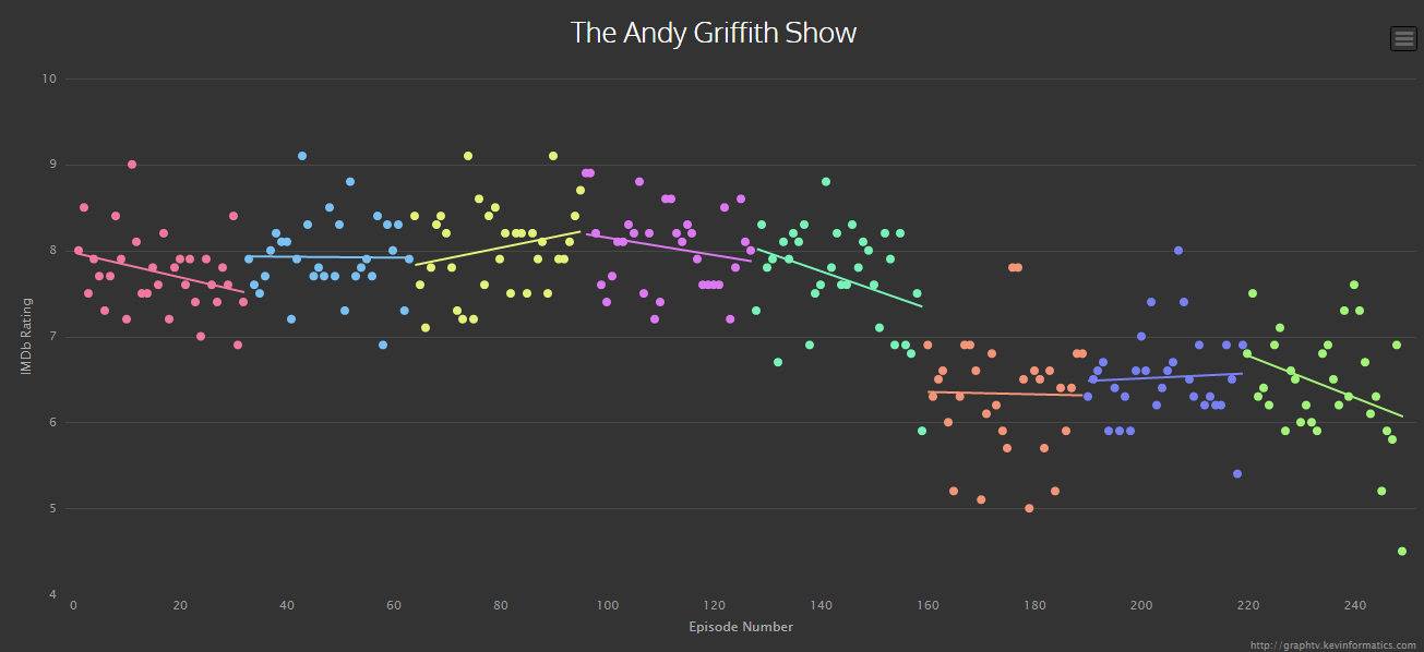
Each dot represents the rating for a single episode.
This cool chart tracks IMDb ratings of Andy Griffith Show episodes.
It clearly shows how IMDb reviewers hate the sixth season, when Don Notts left and color was adopted. It’s also interesting, though, to observe the trendline for the fifth season that is obviously declining–perhaps in anticipation of the sixth season…?
@kevinwuhoo created the Graph TV site, which allows you to track any show’s IMDb ratings. As he explains,
Graph TV is a visualization tool which graphs tv show ratings by episode. Each season is assigned a different color and linear regressions are calculated for each season as well as for the entire series. Each point on the graph displays the episode title, rating, and other data. The data points are clickable and will open its IMDb entry. The graphs are also exportable for offline use.